London Architecture
- Fanni Horvath -
Evaluation
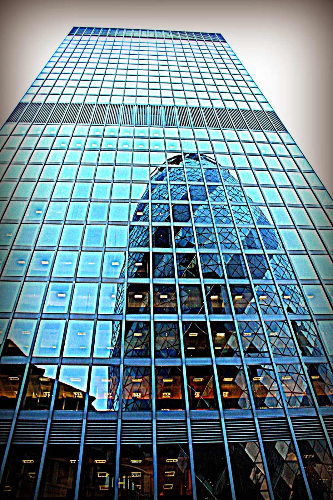
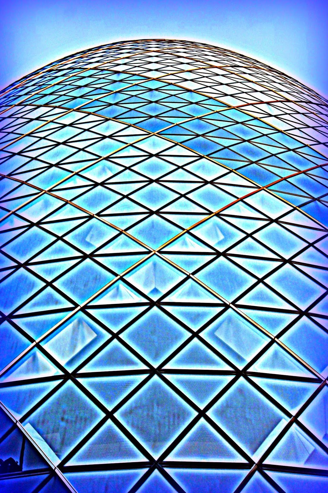
I used Berenice Abbott and Cameron R Neilson's works as an influence, when taking my own architecture photographs as I liked the way Abbott varied her angles and the reflection elements in Neilson's images. Some of my images are very similar to the images that I researched as both sets of images kind of shot from similar angles and has similar perspective. I really like the composition of my images because it uses either the rule of thirds to compose itself or me bent the camera in a way so the images have a triangular composition. The point of view of my images are the same all the way through as I was standing close to the buildings, pointing the camera up in nearly 90 degrees and shot from a low angle, but I like the effect of it as it really shows the height of the buildings and the viewer can imagine the size difference between the photographer and the building. I shot the images on two different days but the weather/lighting conditions were nearly the same on the two days, sunny and cloudy in places. I chose the same time for the shooting on each to make sure I kind of work with similar temperature of light. My camera was mainly set on shutter priority mode as it was easier for me if the camera automatically set the F stop. Where I wasn't surrounded by buildings my ISO was on 100 but in the shade of the buildings I had to change it sometimes to higher value and decrease my shutter speed to still get well exposed images. I was also looking for patterns and reflections and truly those images are my favorites because of the closer details and image in an image effect. The diagonal lines, straight lines, curvy linear lines are the decisive elements of my photos. The main formal element that has been applied on my images. I'm extremely happy about the outcomes not just about the composition but also about the fake HDR effect that I applied on my images in post editing. The picasa's HDR tool was a perfect choice to work with and easy to adjust the look of the images for my taste. It kept the strong quality of the images and helped me to produce something amazing. I just love the greater range of luminance levels, these highly contrasted look of scenes, it kind of look surreal but I like it because my images look better and more vibrant. Without not applying this technique my images would never look like this, because although I set up the camera correctly to get the right exposure and well lit images, even the best exposure gave a blown out highlights and flat shadows. Overall, I'm very happy with the results and I think that my researched really helped me to produce high quality images that looks interesting and can be applied in magazines or adverts, depending on what's the company's purpose with my image.
My architecture photography

F9, 1/160, ISO100

F8, 1/200, ISO100

F9, 1/200, ISO100

F8, 1/160, ISO100

F6.3, 1/200, ISO800
F4.5, 1/60, ISO800
Showing the fake HDR editorial process in Picasa 3 step by step...
Original to fake HDR
 |
| F5, 1/60, ISO200 |
Step 1: open the editor software Picasa 3 from your desktop icon.
Step 2: find the folder where there image is and select it.

Step 3: double click on the image to open it in edit view.

Step 4: find the HDR effect in the tool bar, adjust the ratio, strength and fade to your taste and click 'apply'.


Step 5: Find the boost tool and adjust the strength to your taste then click 'apply'.

Step 6: If you want to add vignette to your image you can find the tool at the same place where the boost tool was. You can choose the colour of the vignette and adjust the size,strength,fade of it.


Step 7: If you happy with the image by clicking on File and Save As you can save the edited photo.

No comments:
Post a Comment